ShortHaus Cinema’s Collages
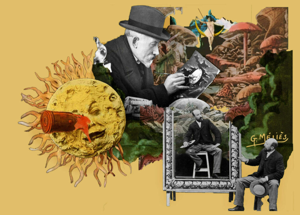
If you’ve visited our website or walked by our displays, you might have seen a busy collage advertising the next ShortHaus Cinema program. Patrick and I (Studio 300 Specialists) chose to brand the ShortHaus programs with loud, photomontaged designs, combining images of the featured director living within their film work.
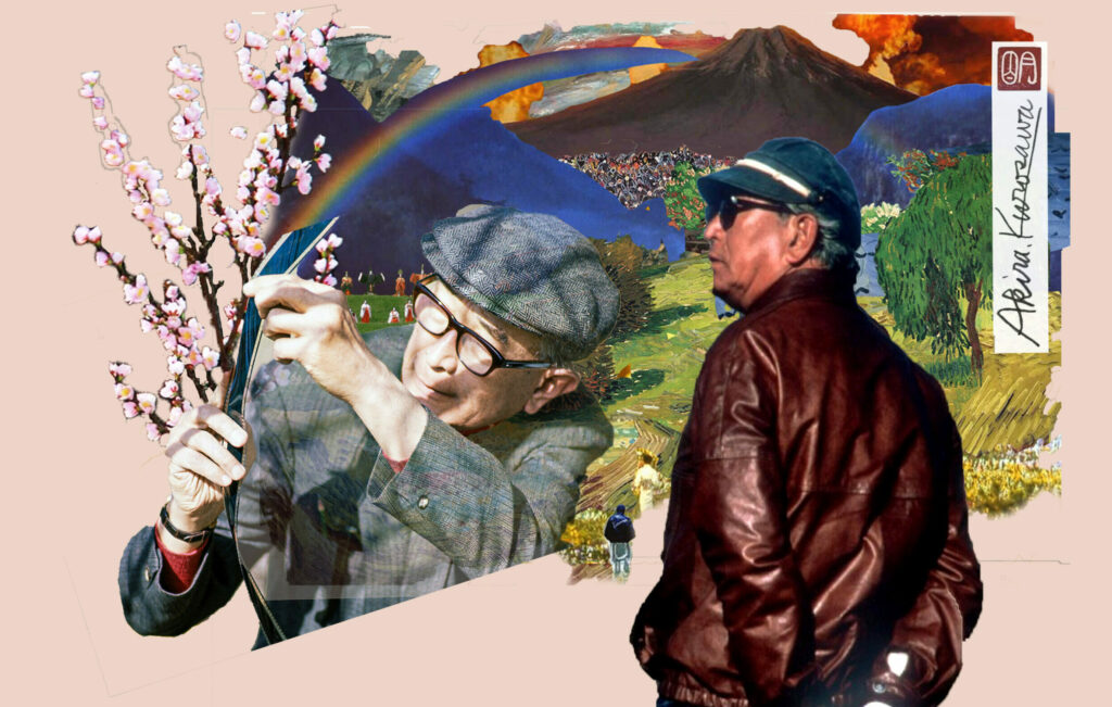
The choice to create these collages isn’t merely aesthetic (although they do look cool). We want to show off our personality as creators and encourage other creatives to join us in appreciating the art of short-form filmmaking.
I personally have a visual arts background and have been particularly drawn to collage, using it in its traditional form and in oil paintings with wallpaper and fabric pasted into them. Even in my videos, multiple angles will be plastered atop one another in a single frame. It felt appropriate to return to these roots in collage while representing directors with such distinct visual styles.
A Brief History
Collage has often had its start credited to the cubists, Dadaists and surrealists of the early 20th century. In reality, the history of collage is inherently tied to photography and the domestic arts.
Photomontage goes as far back as photography itself, and decoupage techniques were used even in the 18th century to decorate screens and make scenes with fashion magazine cutouts (sound familiar?). In many ways, collage hasn’t changed. It’s an extremely accessible art form, and we’ve all grown up chopping magazines to pieces and haphazardly gluing bits together. We’ve simply developed more powerful tools, like Photoshop, to make the process faster.
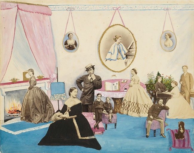
untitled collage from the Filmer Album, Lady Filmer, mid-1960s
Collage transforms the sourced images by placing them into new contexts. That context could be as simple as taking a portrait and changing the background to place the figure in a new location. Or, by chopping up bodies (paper, not flesh) and piecing them together (with glue, not surgically), you can reform them into one semi-grotesque individual that represents the awkwardness of having a body.
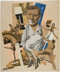
Hannah Hoch, The Father, 1920
For an example, we can look at Hannah Hoch, an important Dada artist (and the only woman commonly associated with the movement). She loved to play with body and gender by reforming idealized images into awkward, stunted versions. In “The Father,” the head of a man is spliced onto the body of a mother holding her child. Around this eponymous father, we see feminine and masculine figures twisted in movement, the delicate motion of ballet vs. the aggressive motion of wrestling. How do these contradictions reframe ideas of man and woman, mother and father? Hoch asks these questions playfully by using a medium any individual with paper and scissors could replicate.
The Art of Editing: Video Montage
Video montage reuses the same language as photomontage. We know montages as a way to quickly convey information, usually condensing the passing of time (a training or shopping montage). Montage is a French word that literally means “assembly.” All that needs to exist for something to technically be a montage is two unlike things composited together.
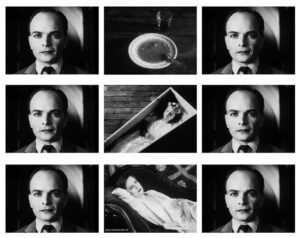
The Kuleshov Effect
In this way, film itself is like a collage. The art of editing is entirely dependent on juxtaposing images to convey information. The Kuleshov Effect is what drives film editing. In a cut from frame A to frame B, whatever is in frame B will inevitably change the meaning of what was just seen in frame A. With editing, we jump from one scene to the next and the story is told by the in-between, the relationship of one image to the next, combined. Collaging unlike fragments to create a narrative.
There’s also the special effects compositing that makes a single frame feel like a physical collage. We can see this in the work of Akira Kurosawa (previously featured by ShortHaus in July) and Georges Méliès (to be featured this coming September 5). Both directors were painters first. They each painted their own storyboards (Méliès being one of the first to use storyboards at all), and that shows in the visual dynamism of their work.
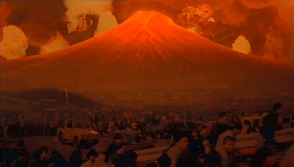
from Akira Kurosawa’s Dreams, 1990
The short piece “Mt. Fuji in Red,” from Kurosawa’s Dreams, 1990, has a distinct divide where the filmed action of crowds running through the streets in terror separates from the explosions going off behind the long-dormant volcano. The disjointed visual adds to the surreality of the moment. The idea of Mt. Fuji going off and taking all of Japan with it is so hard to wrap our minds around.
Méliès’s films feel especially collaged with his use of spliced film and double exposures creating multiples of himself. The hand-drawn nature of his sets and props, the two-dimensional angle the camera stays at, and the hand-painted or stencil-painted colorization all add a physicality to each work that feels closer to a still photomontage than contemporary films with their slick VFX.
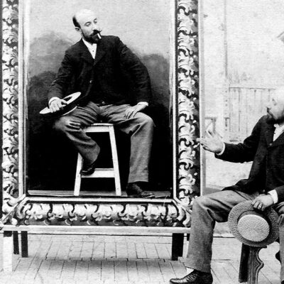
from Méliès’s A Mysterious Portrait, 1899
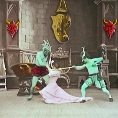
from Méliès’s The Infernal Cauldron, 1903
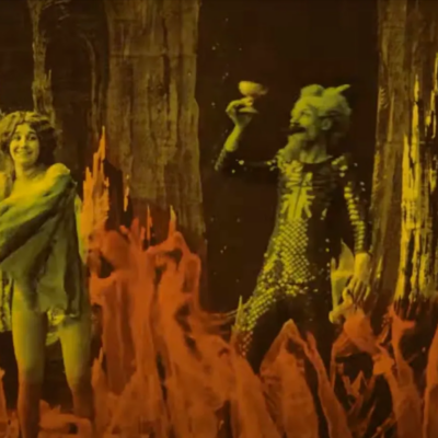
from Méliès’s The Infernal Cave, 1905
With their painterly style, I was inspired to return to my roots as a visual artist. The dense and surreal collages I composite together are emblematic of each director’s work as a whole. We want these images to speak to fellow creatives. We want to encourage anyone interested in film to just start making, even if it’s just a series of disparate images edited together. Come collage with us.
Our ShortHaus meetings are on the first Tuesday of every month. Check the events calendar and join us soon!
Upcoming: ShortHaus Cinema Presents: Georges Méliès, September 5, 7 p.m., Meeting Room C
